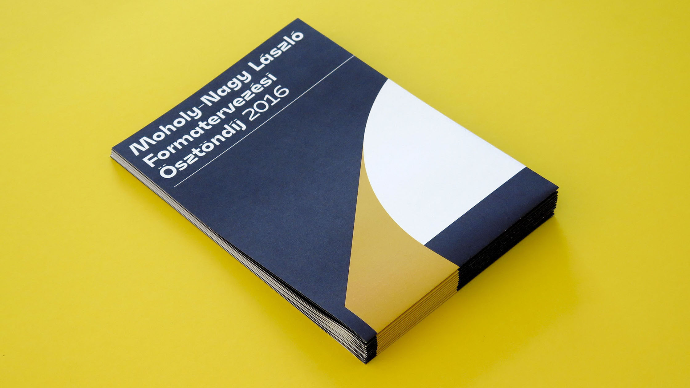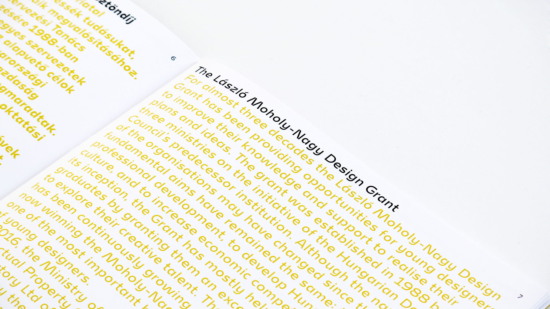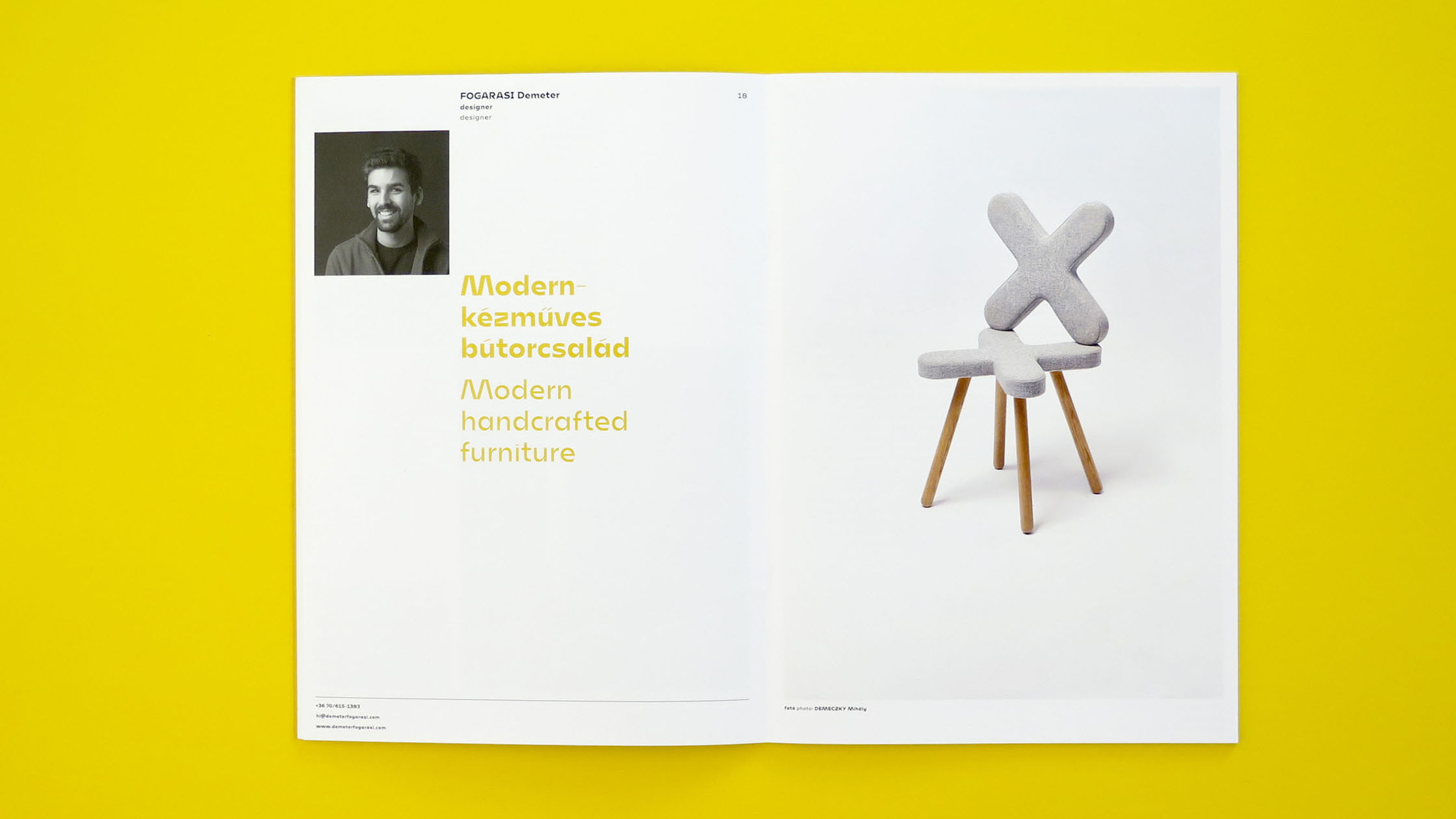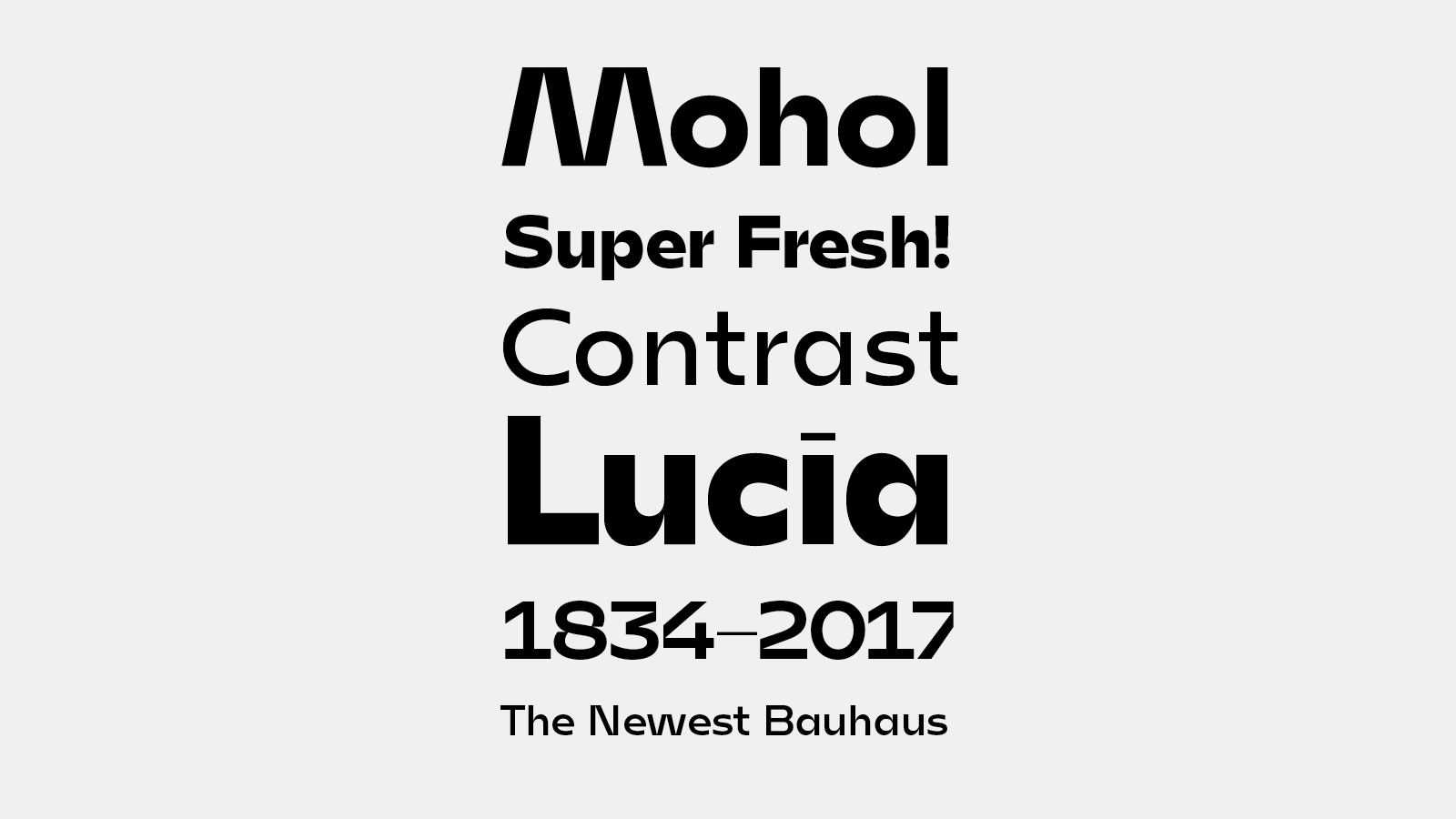
Custom typeface for the László Moholy-Nagy Design Grant
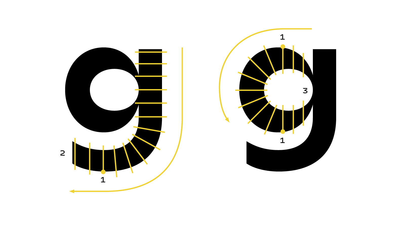
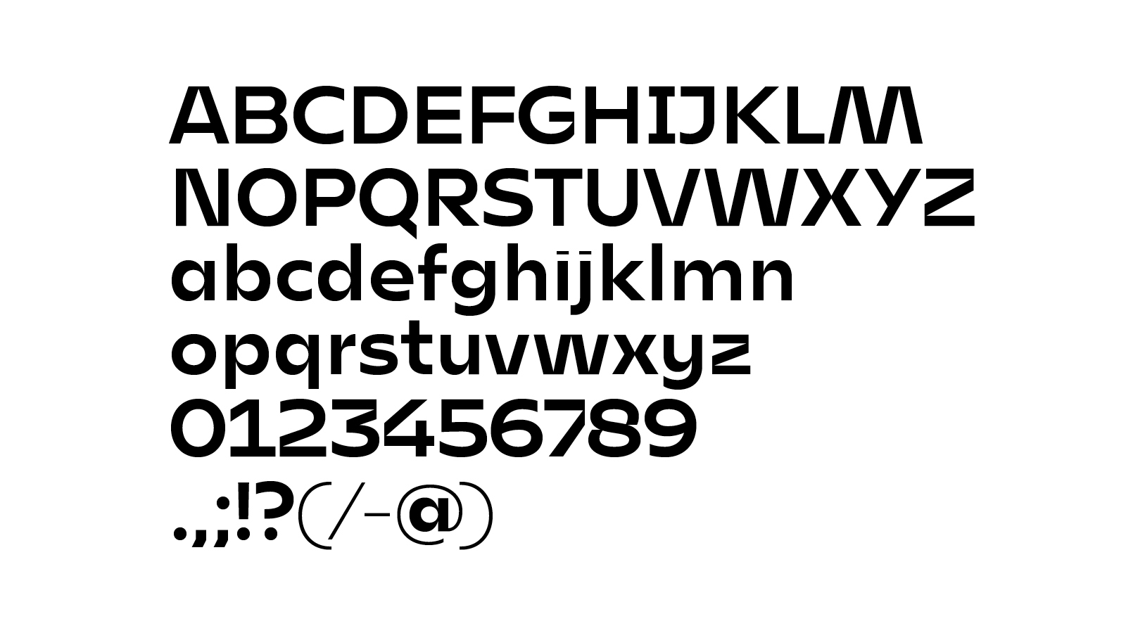
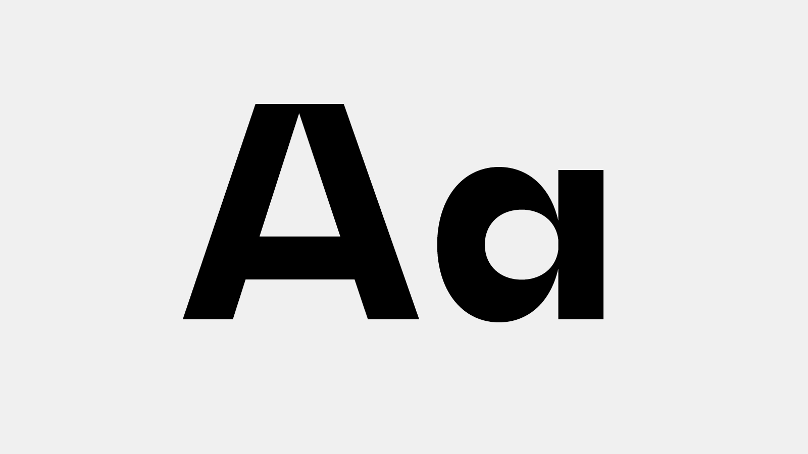
I started to experiment with my Pilot Parallel Pens. I was curious, how could I draw sans-serif letters with similar horizontal and vertical weights. I worked out a method: when I reached the top or the bottom point of a shape (1), I didn’t turn to continue the shape, but I held my pen only vertical or horizontal, and finished the shape with that movement (2). See on the illustration below. With this idea I’ve got really high contrast at the connections (3). With changing the pens from 2.4- to 6 mm wide, I could sketch the shapes from Thin to Black really easy. I got similar contrasts at the connections, but different widths.
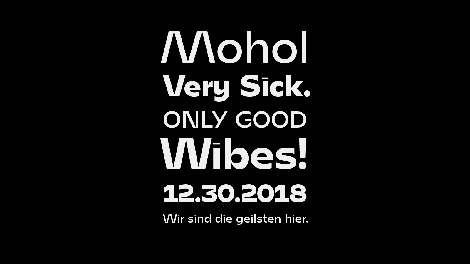
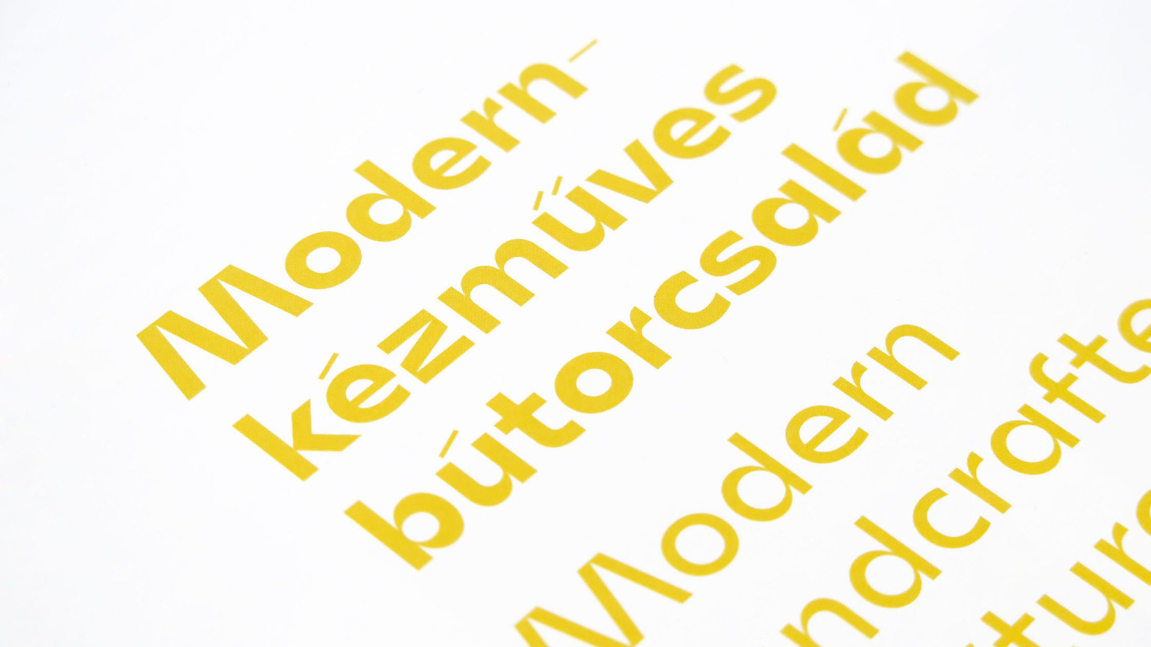
Mohol is available as a retail font.
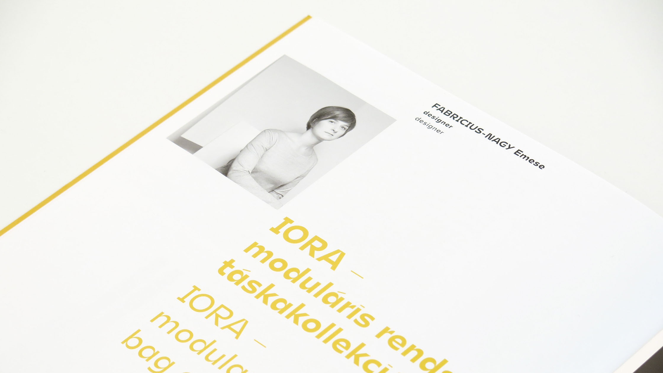
Client: Hungarian Design Council